Environment and Climate Change Canada has just revamped the way Canadians view their weather radar (See figure 1 below). Unfortunately the user experience of the new site is two steps forward and five steps backward, particularly for the visually impaired.
The new site (Figure 1, below) has the following advantages, as compared to the old:
- The map can be zoomed and panned: the old maps (Figures 3 and 4 below) could not be zoomed and were of fixed areas. On a computer, the map also fills the whole width of the screen to cover more territory (but cannot be extended vertically).
- A single composite map: Rather than showing individual radar stations, or provincial composites, it shows a single unified map including all North American weather stations.
There are more options for
The new site has the following disadvantages as compared to the old; I have ranked these in order starting with the most important:
- Very bad background colours: The old maps (Figures 3 and 4) had vastly better colour contrast between non-precipitation and precipitation; land was brown and water was very dark blue. Light rain or snow was highly contrasted against this, making it easy to see. The new map (Figure 1) uses light blue both for light precipitation and also for water, making viewing the maps hard for everybody, but especially for the visually impaired. The default background is also light in colour. This will not be usable for anyone who is colourblind. Various US-based radar maps (such as in Figure 2) do a much better job, and show rivers and lakes much better too. The new maps have a 'simple' option for background colours, but this is only marginally better than the default, and eliminates useful geographical references like roads. Water features are very hard to see in the simple mode. Solution. Revert to the old background, or use darker colours for the light precipitation. At least allow other choices for background. This should not be hard to do.
- Compass directions are wrong in local views. The map projection used for all views is "Canada Base Map Transportation". That projection has the advantage that it shows distances and area consistently, a feature useful for displaying the entirety of Canada without distorting the amount of land taken up by the arctic and other northern areas. But for the radar maps there is no northern coverage so the usefulness of this is questionable. Instead the new weather radar projection mean that when zoomed in to a local view in the east, straight up in the map is Northeast, and a horizontal line runs from Northwest to Southeast (opposite on in Western Canada). Directions are only right in Manitoba; in Ontario they are disconcertingly 'off' and in the Atlantic provinces they are totally wrong. This hinders understanding of the incoming direction of precipitation and storms, a critical feature of the weather radar maps. Solution: Either adjust the orientation as the map is zoomed in, so 'up' remains North, or else provide separate local views. At the very least show a compass rose on the maps, since people need to know the direction from which precipitation is coming.
- Cannot zoom fully in: The map cannot be zoomed in far enough, as is often useful to see local detail. With the old map the entire browser window could be zoomed in, but this is much harder in the new maps. Solution: Allow several more clicks on the +, or further pinching, to zoom more fully in to show a small local area. This would be extremely useful to see when precipitation is about to approach local features, and can help the visually impaired.
- Forced scrolling down on the web page to see the map: On opening the page, the map doesn't immediately appear, instead there is a big 'Government of Canada' heading taking up space, and an even bigger announcement 'We have a new weather radar map'. Solution: Use much less vertical space for these superfluous elements.
- Fuzzy text: Note the lack of crispness in the text for the geographical features in figure 1, as compared to the other figures.
- No scale. The old maps had a scale.
Figure 1 (below): New Canadian weather radar. Notice the light blue for precipitation near North Bay, that is too similar to the light blue of water. Note that the compass directions are distorted, with Brockville (just at right side of the map) appearing south-southeast of Ottawa, rather than south.


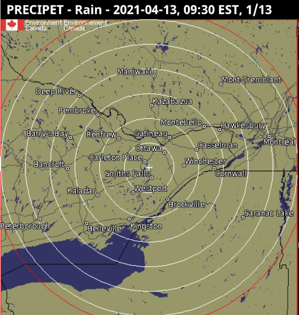
Figure 3 (below): Old weather radar view of Ontario). Still available as 'historical'. Notice the dark background, allowing precipitation to be easily seen. This view has compass distortion; one needs to use the local view (Figure 4) to eliminate that. This view also shows the locations of the radars themselves, which although not entirely necessary, can help people understand the system.

No comments:
Post a Comment
Note: Only a member of this blog may post a comment.