Friday, December 31, 2021

Ontarians should urgently lobby for schools to be online. Covid 19 stats are dangerously spiking

This is an urgent call to lobby the Ontario Government to back off their plan to have schools go back Wed Jan 5th. 

There was evidence in 2020 and 2021 that it was better to keep classes in person. Back then:

  * Kids were less prone to earlier variants

  * Simple masks seemed to work well

  * Cases seemed not to be transmitted in schools very much

  * Interaction in schools could be controlled

  * Testing was working

  * We had vaccination levels in Fall 2021 that were high and vaccines seemed to be stopping transmission

But things are different with the current wave of Omicron. Even though there is evidence Omicron is milder, there is now much better evidence that Ontario classes should be online for a few weeks, especially for grades where kids can stay alone at home (Grade 7 and up)

15 Reasons why Ontario kids should should go online in January 2022, at least for a couple of weeks:

  1.   Kids seem to be as prone to current variants as adults
  2.   Transmissibility of Omicron is vastly higher
  3.   N95 masks are needed, and kids don't have them, and they are not in stores
  4.   Testing is not working since the system is overwhelmed (both lateral-flow/rapid-response and PCR)
  5.   Lateral-flow tests seem to be working less well on Omicron
  6.   So many people have symptoms that absences in schools will be super-high if families obey the isolation rules, such that obedient kids/families will miss important material and/or teachers will have to repeat it
  7.   Kids who hide symptoms so as not not miss material and hence don't isolate will just keep Omicron going.
  8.   Rt rates in Ontario are crazy high (mostly in 1.5 to 1.8 range; see below)
  9.   Case rates per 100K are crazy high; mostly over 400 (here in Ottawa 1508 today, which is vastly above the highest ever before in this pandemic, and that is even with inadequate testing!)
  10.   Hospitalizations are just starting to spike ... and this is a key issue; we have to wait it out to see this number stays down as high hospitalization will result in deaths.
  11.   Kingston, which spiked 2 weeks ahead of other Ontario health units is one of the few places with declining cases, likely in part because so many people had it, and because Queens students are home. Maybe, just maybe, numbers elsewhere will come down in 2 weeks; let's be prudent and wait until then
  12.   The Wastewater signal is spiking (at least in Ottawa, see below)
  13.   And we haven't yet seen the normal spike that is likely to happen after irresponsible people party at New Years.
  14. Although vaccinated people are much less likely to end up in hospital, they still are getting symptoms and still have to isolate, causing havoc with education
  15. We know how to do online education now; it is far inferior to in-person, but with luck this would only be for a couple of weeks.

Latest startling data from Ottawa as reported by CBC (note that their chart of cases has the maximum X-axis value of 800, so the 1700 is off the chart! https://www.cbc.ca/news/canada/ottawa/covid19-ottawa-cases-december-31-1.6301311

Latest wastewater data for Ottawa: https://613covid.ca/wastewater/

Epidemiological summary for Ontario health units from Ryan Imgrund: https://www.imgrund.ca/ontario-phu

We need to wait it out. It is irresponsible to have kids go back in person in the coming days. We need to see Rt go back to the range close to 1 (maybe 1.05), and cases per 100K down to maybe 40, and the testing system to recover its capacity to test everybody who has symptoms, so we can get an accurate picture of what is going on. 

Whether or not schools are 'safe places' now is irrelevant, even though highly doubtful. The symptomatic people and contacts all isolating (teachers and kids) will nonetheless render in-person education pointless, and actually make online education better educationally. 

Tuesday, April 13, 2021

New Canadian weather radar website a user experience disaster. Urgent fixes needed.

Environment and Climate Change Canada has just revamped the way Canadians view their weather radar (See figure 1 below). Unfortunately the user experience of the new site is two steps forward and five steps backward, particularly for the visually impaired.

The new site (Figure 1, below)  has the following advantages, as compared to the old:

  • The map can be zoomed and panned: the old maps (Figures 3 and 4 below) could not be zoomed and were of fixed areas. On a computer, the map also fills the whole width of the screen to cover more territory (but cannot be extended vertically).  
  • A single composite map: Rather than showing individual radar stations, or provincial composites, it shows a single unified map including all North American weather stations.

There are more options for

The new site has the following disadvantages as compared to the old; I have ranked these in order starting with the most important:

  • Very bad background colours: The old maps (Figures 3 and 4) had vastly better colour contrast between non-precipitation and precipitation; land was brown and water was very dark blue. Light rain or snow was highly contrasted against this, making it easy to see. The new map (Figure 1) uses light blue both for light precipitation and also for water, making viewing the maps hard for everybody, but especially for the visually impaired. The default background is also light in colour. This will not be usable for anyone who is colourblind. Various US-based radar maps (such as in Figure 2) do a much better job, and show rivers and lakes much better too. The new maps have a 'simple' option for background colours, but this is only marginally better than the default, and eliminates useful geographical references like roads. Water features are very hard to see in the simple mode. Solution. Revert to the old background, or use darker colours for the light precipitation. At least allow other choices for background. This should not be hard to do.
  • Compass directions are wrong in local views. The map projection used for all views is "Canada Base Map Transportation". That projection has the advantage that it shows distances and area consistently, a feature useful for displaying the entirety of Canada without distorting the amount of land taken up by the arctic and other northern areas. But for the radar maps there is no northern coverage so the usefulness of this is questionable. Instead the new weather radar projection mean that when zoomed in to a local view in the east, straight up in the map is Northeast, and a horizontal line runs from Northwest to Southeast (opposite on in Western Canada). Directions are only right in Manitoba; in Ontario they are disconcertingly 'off' and in the Atlantic provinces they are totally wrong. This hinders understanding of the incoming direction of precipitation and storms, a critical feature of the weather radar maps. Solution: Either adjust the orientation as the map is zoomed in, so 'up' remains North, or else provide separate local views. At the very least show a compass rose on the maps, since people need to know the direction from which precipitation is coming
  • Cannot zoom fully in: The map cannot be zoomed in far enough, as is often useful to see local detail. With the old map the entire browser window could be zoomed in, but this is much harder in the new maps. Solution: Allow several more clicks on the +, or further pinching, to zoom more fully in to show a small local area. This would be extremely useful to see when precipitation is about to approach local features, and can help the visually impaired.
  • Forced scrolling down on the web page to see the map: On opening the page, the map doesn't immediately appear, instead there is a big 'Government of Canada' heading taking up space, and an even bigger announcement 'We have a new weather radar map'. Solution: Use much less vertical space for these superfluous elements.
  • Fuzzy text: Note the lack of crispness in the text for the geographical features in figure 1, as compared to the other figures.
  • No scale. The old maps had a scale.

Figure 1 (below): New Canadian weather radar. Notice the light blue for precipitation near North Bay, that is too similar to the light blue of water. Note that the compass directions are distorted, with Brockville (just at right side of the map) appearing south-southeast of Ottawa, rather than south.


Figure 2 (below): Weather Underground Radar of the same area as Figure 1. Notice the dark contrast for the precipitation, and the visibility of the lakes. Notice also that the international boundary in Lake Ontario which runs east to west is horizontal, and Brockville appears corectly South of Ottawa. Crispness of the map is also better, with little lakes shown more clearly against the background (this often greatly helps boaters trying to interpret incoming storm patterns)


Figure 3 (below): Old weather radar view of Ontario). Still available as 'historical'. Notice the dark background, allowing precipitation to be easily seen. This view has compass distortion; one needs to use the local view (Figure 4) to eliminate that. This view also shows the locations of the radars themselves, which although not entirely necessary, can help people understand the system.


Wednesday, November 18, 2020

Idea for a Covid-19 vaccination priority calculator

I have created a spreadsheet in Google Sheets to suggest a prioritization scheme for Covid-19 vaccinations. People with the highest score in this scheme ought, I think, to be vaccinated first.

If you have a Google account, you can click here to make a copy of the spreadsheet in your account. Or if you have Excel, you can download a copy here. The spreadsheet is called VaccinationPriority.xlsx

In your copy, place an x in column C of any of the rows corresponding to categories of risk factors that apply to you. Your suggested vaccination priority will appear in cell A2 (a value up to 30).

Please note: This is not medical advice, and public health authorities will want to set up their own schemes. The idea of this spreadsheet is simply to present one scheme for how these priorities could be set. In fact, a website with calculations like this could be used to actually schedule people into waves at vaccination clinics.

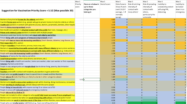
The image of the spreadsheet (below) shows how this works.

The risk categories (rows) include type of work (background yellow), health status (background light orange), living situation (background light blue), and places you go other than for work (background light green). Up to three categories (the most risky ones that apply to you) are used to calculate your score.

Columns E through I show five risk factors (with values up to 5) for each of the risk categories. These factors are the following:

  • Column E: Risk of severe illness if you catch Covid-19. This mostly applies to people with risk categories relating to their health. Immunocompromised peope are given a risk level of 5, followed by people with multiple specific diseases such as heart disease and diabetes. Being elderly is a factor here too, but is weighted less.
  • Column F: Risk of catching Covid-19 because your risk categories tend to put you in contact with other people (perhaps high risk people) and perhaps for extended times in transmission-prone environments. Health care workers, first responders and those whose work puts them in direct and close contact with people (e.g. hairdressers) are given the highest risk factor here. But the risks are only set at a maximum of 3 since PPE can likely mitigate the risk if used properly.
  • Column G: Risk of spreading Covid-19 to others if you do catch it and are in contact with others before diagnosis. Home care workers, workers at care homes, and health care workers are given considered the highest risk here. Whereas vaccination due to risks in columns E and F is primarily to protect the person vaccinated, Column G is all about protecting others.
  • Column H: Risk due to being potentially unable to protect yourself sufficently using PPE.  Home care workers and people like hairdressers have the highest risk here. 

The score for any of the risk categories (rows) is determined 90% from the maximum score in the above four columns.

  • Column I: Feasibility of being fully locked down in an emergency. If Covid-19 surges where you are, can you simply eliminate the risk factor? Some kinds of workers have been and will likely continue to work at home, or could start to do so. Risk factors relating to illnesses have non-zero values here because they may need ongoing medical attention.  I have given this only 10% of the weight in the row (risk category).

Note that there are some risk factors and risk scores that are negative: For example whereas most risk categories are scored as zero for risk of severe illness, I have marked students as -1 for this factor as most of them are young. Similarly, people who can isolate a lot can have negative values for risk of catching and risk of spreading. These negative values can counteract positive values, such as being elderly.

Your ultimate score is calculated as 3 times your top risk category score, plus 2 times your second risk category score (if you have one) plus your third risk category score. The highest possible value, with an x in cells C3, C4 and C5 (a care home medical worker who also gives care at private homes) would be 28.84. 

My score is zero. I actually have no risk categories! I can work in isolation most of the time, but I do have children in school, so I do not fit rows 33 or 34. My kids, who are students, would have risk factors of 5.52, which is quite low, but higher than my score. But they should be vaccinated before me as a result. This is illustrated in the image below. If the University resumes in-person classes, then as a teacher I would have a score of 5.7. I am not visiting my elderly father currently (and haven't since the pandemic started), but if I needed to on a regular basis, while also teaching, then my score would be 15.14. My father, who is over 75 but can isolate would have a score of 5.52.

This spreadsheet can be used to help Boards of Health decide on vaccination priority. The basic idea is that vaccination should be prioritized for those with higher risk categories, and that multiple risk categories should be combined (but not additively).


Image of the VaccinationPriority spreadsheet with an x in the cell indicating the person is a student


The following is a closer look at the risk categories, from greatest to lowest, and their calculated scores. Your score would be three times the one highest in the list, plus 2 times the second one in the list, plus the value of the one third on the list.

Workers of any kind at homes for the elderly and infirm4.82
Essential home care workers (e.g. people who go to private homes to help the elderly or infirm)4.8
Health care workers in contact with patients (nurses, doctors, paramedics, dentists, other hospital/clinic workers)4.78
Severely immunocompromized people4.66
Non health-care workers in physical contact with the public (hair care, massage, etc.)3.84
Prison and criminal justice workers in contact with multiple people3.8
Volunteers and close family members who must visit elderly and infirm3.78
Person living with and caregivers of immunocompromized people3.74
People with two or more risk-increasing conditions (heart disease, diabetes, lung disease, etc)3.72
First responders (fire, police) 2.98
Obligate travellers (Truck drivers, aircrew, train crew, etc)2.9
Workers in essential businesswith contact with many different clients(grocery store workers etc.)2.9
Workers in nonessential businesses in contact with many different clients(e.g. restaurant servers)2.82
People with one risk-increasing health condition (heart disease, diabetes, lung disease, etc.)2.78
Residents of homes for the elderly and infirm2
Local transportation workers (bus drivers, taxi drivers, etc.)2
Person living with a health care worker, home care worker, elder care worker or first responders1.94
Inmates of prisons and similar1.94
People in any category who are marginalized due to dense living, poverty, discrimination1.94
Daycare workers1.92
Teachers and staff in contact with students, plus workers in gyms and similar1.9
People who use public transit or have to spend time in crowds and their families1.88
People above 75 (note that they are likely to also be in other categories above)1.84
Students in school1.84
Workers who tend to encounter random people while cleaning, doing maintenance, renovations, etc.1
People working in small groups, almost always with the same people1
People living in households with anyone scoring 15 or above out of 300.98
People in areas with reduced access to emergency medicine0.96
People above 60 but below 750.92
People not included in other categories who could help boost economy if more employed (e.g. allowing businesses to open more fully)0.04
Workers not in isolation but who can avoid interacting with others and avoid public transit-0.04
Workers who can work in isolation most of the time and their families, none of whom are in other categories-0.08
People who can totally isolate indefinitely (e.g. have everything delivered)-0.3

Saturday, November 14, 2020

World Maps of Covid-19 as of Nov 13: Deaths and new Cases per capita

Since the beginning of the pandemic, I have have been periodically posting lists of the most severely affected countries, as well as some maps of Covid 19 spread and intensity.

Here are some updated maps as we surge through a second wave. This data, as before, comes from Worldometer. I have not been able to find charts precisely like those below anywhere else so I hope this data analysis will continue to be useful to some people.

First: New cases yesterday (Nov 13, 2020), per million people. European countries including Austria, Switzerland and Czechia are doing the worst,  with USA 19th and Canada 64th. This unfortunately hints at overall spread and at upcoming potential deaths.


Here are the most impacted 10 countries in the above map that have more than 5 million people (you can click through to get detailed country data). This is colour coded by region of the world.

Austria1062.1
Switzerland776.6
Czechia686.3
Italy676.9
Portugal653.2
Poland635.7
Bulgaria607.9
USA553.6
Hungary528.1
Romania494.5
Spain457.0
Jordan436.4
Belgium430.9
UK401.4
Serbia401.1
Slovakia370.7
France364.2
Netherlands355.2
Greece292.0
Lebanon279.4


Second: New deaths yesterday, per million people. This indicates the current severity of the pandemic. France and Czechia are suffering the most currently. USA is 34th and Canada is 55th.


Below is the data for the most-affeted 20 countries that have more than 5 million people, in the above map.

Czechia16.0
France14.3
Bulgaria12.3
Switzerland11.9
Belgium11.5
Poland11.1
Hungary10.3
Italy9.1
Romania9.1
Jordan6.9
Portugal6.8
Spain6.6
Austria5.9
Argentina5.8
UK5.5
Iran5.5
Slovakia4.9
Tunisia4.9
Mexico4.8
USA4.2


Third: Recency: Percent of yesterday's cases as compared to all cases. This highlights where countries are doing worse now than they were in the first wave. Again, European countries dominate this list. USA is 50th and Canada 52nd. The red countries are suffering much worse this time around, but the light orange countries are also having a notable second wave (as compared to the first wave). Canadians are alarmed by our surge this time, and indeed we are doing worse than the first wave, but other countries are suffering far more, especially when you look at the above two maps.


Below are the most affected 20 countries from the above table

Austria5.0
Serbia4.5
Bulgaria4.4
Greece4.4
Hungary3.9
Italy3.7
Poland3.6
Jordan3.3
Portugal3.3
Germany3.0
Malaysia2.9
Sri Lanka2.9
Romania2.8
Switzerland2.6
Congo2.5
Norway2.5
Slovakia2.4
Ukraine2.3
Kenya2.2
UK2.1


Wednesday, October 28, 2020

US Presidential Race tightens a little, but Biden still predicted to eke out a win: Final meta-poll-tracker

 This is my final meta-analysis of 2020 US presidential poll trackers. For previous ones see here.

Since October 17th the Economist has shifted considerably towards a win by Biden, with 7 states showing shifts towards the Democrats and none towards the Republicans. This includes close states North Carolina, Iowa and Ohio (the latter two moving to Toss-up status).

CBC, on the other hand, has shifted 6 states a little towards the Republicans and 3 states a little toward the Democrats. The only close states with shifts, however, are all in the Republican direction: Florida and North Carolina (which become toss-ups, instead of likely Democrat) as well as Pennsylvania (which becomes likely Democrat instead of very likely).

Electoral-Vote.com has shifted Arizona towards the Republicans, from very likely Democrat to just likely Democrat and has adjusted the confidence level in three states that are on the Republican side of the chart.

Princeton has shifted Texas a little to the Democrats and adjusted two other Republican states a little.

Finally, Real Clear Politics has made two slight changes toward the Democrats in non-close states.

But the net result is that no state changes in its overall ranking on the spectrum from certain Democrat to certain Republican. If all the polls and poll trackers are doing a decent job, Biden will at least overtop the magic 270 Electoral College votes (EVs) by winning three states that Trump won in 2016: Nevada, Wisconsin and Pennsylvania. That would give him 279 EVs (or 280 with the Nevada second district), which I will call my prediction.

But looking more closely at the polls, there is a clear trend whereby Biden's margin has been dropping. This happened to Clinton too. I wouldn't be confident in any state where the polls show less than a 4 point lead for Biden. That means he might only get those 279 votes. And if he lost Pennsylvania, as is entirely possible due to the fracas over fracking, then he would need to win a state like Arizona (plus a single Nebraska district which is likely) or North Carolina.

So I also think Biden will win the popular vote nationally by 6%, which should help quell naysayers, although is below what the current polling average is predicting. I say this because of the desperation and passion of Trump supporters, and the fact that they are less likely to be concerned by the pandemic, and hence might come out to vote in higher numbers.

I think the results will only be known for sure a couple of weeks after election day.