Friday, December 31, 2021

Ontarians should urgently lobby for schools to be online. Covid 19 stats are dangerously spiking

This is an urgent call to lobby the Ontario Government to back off their plan to have schools go back Wed Jan 5th. 

There was evidence in 2020 and 2021 that it was better to keep classes in person. Back then:

  * Kids were less prone to earlier variants

  * Simple masks seemed to work well

  * Cases seemed not to be transmitted in schools very much

  * Interaction in schools could be controlled

  * Testing was working

  * We had vaccination levels in Fall 2021 that were high and vaccines seemed to be stopping transmission

But things are different with the current wave of Omicron. Even though there is evidence Omicron is milder, there is now much better evidence that Ontario classes should be online for a few weeks, especially for grades where kids can stay alone at home (Grade 7 and up)

15 Reasons why Ontario kids should should go online in January 2022, at least for a couple of weeks:

  1.   Kids seem to be as prone to current variants as adults
  2.   Transmissibility of Omicron is vastly higher
  3.   N95 masks are needed, and kids don't have them, and they are not in stores
  4.   Testing is not working since the system is overwhelmed (both lateral-flow/rapid-response and PCR)
  5.   Lateral-flow tests seem to be working less well on Omicron
  6.   So many people have symptoms that absences in schools will be super-high if families obey the isolation rules, such that obedient kids/families will miss important material and/or teachers will have to repeat it
  7.   Kids who hide symptoms so as not not miss material and hence don't isolate will just keep Omicron going.
  8.   Rt rates in Ontario are crazy high (mostly in 1.5 to 1.8 range; see below)
  9.   Case rates per 100K are crazy high; mostly over 400 (here in Ottawa 1508 today, which is vastly above the highest ever before in this pandemic, and that is even with inadequate testing!)
  10.   Hospitalizations are just starting to spike ... and this is a key issue; we have to wait it out to see this number stays down as high hospitalization will result in deaths.
  11.   Kingston, which spiked 2 weeks ahead of other Ontario health units is one of the few places with declining cases, likely in part because so many people had it, and because Queens students are home. Maybe, just maybe, numbers elsewhere will come down in 2 weeks; let's be prudent and wait until then
  12.   The Wastewater signal is spiking (at least in Ottawa, see below)
  13.   And we haven't yet seen the normal spike that is likely to happen after irresponsible people party at New Years.
  14. Although vaccinated people are much less likely to end up in hospital, they still are getting symptoms and still have to isolate, causing havoc with education
  15. We know how to do online education now; it is far inferior to in-person, but with luck this would only be for a couple of weeks.

Latest startling data from Ottawa as reported by CBC (note that their chart of cases has the maximum X-axis value of 800, so the 1700 is off the chart! https://www.cbc.ca/news/canada/ottawa/covid19-ottawa-cases-december-31-1.6301311

Latest wastewater data for Ottawa: https://613covid.ca/wastewater/

Epidemiological summary for Ontario health units from Ryan Imgrund: https://www.imgrund.ca/ontario-phu

We need to wait it out. It is irresponsible to have kids go back in person in the coming days. We need to see Rt go back to the range close to 1 (maybe 1.05), and cases per 100K down to maybe 40, and the testing system to recover its capacity to test everybody who has symptoms, so we can get an accurate picture of what is going on. 

Whether or not schools are 'safe places' now is irrelevant, even though highly doubtful. The symptomatic people and contacts all isolating (teachers and kids) will nonetheless render in-person education pointless, and actually make online education better educationally. 

Tuesday, April 13, 2021

New Canadian weather radar website a user experience disaster. Urgent fixes needed.

Environment and Climate Change Canada has just revamped the way Canadians view their weather radar (See figure 1 below). Unfortunately the user experience of the new site is two steps forward and five steps backward, particularly for the visually impaired.

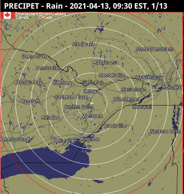
The new site (Figure 1, below)  has the following advantages, as compared to the old:

  • The map can be zoomed and panned: the old maps (Figures 3 and 4 below) could not be zoomed and were of fixed areas. On a computer, the map also fills the whole width of the screen to cover more territory (but cannot be extended vertically).  
  • A single composite map: Rather than showing individual radar stations, or provincial composites, it shows a single unified map including all North American weather stations.

There are more options for

The new site has the following disadvantages as compared to the old; I have ranked these in order starting with the most important:

  • Very bad background colours: The old maps (Figures 3 and 4) had vastly better colour contrast between non-precipitation and precipitation; land was brown and water was very dark blue. Light rain or snow was highly contrasted against this, making it easy to see. The new map (Figure 1) uses light blue both for light precipitation and also for water, making viewing the maps hard for everybody, but especially for the visually impaired. The default background is also light in colour. This will not be usable for anyone who is colourblind. Various US-based radar maps (such as in Figure 2) do a much better job, and show rivers and lakes much better too. The new maps have a 'simple' option for background colours, but this is only marginally better than the default, and eliminates useful geographical references like roads. Water features are very hard to see in the simple mode. Solution. Revert to the old background, or use darker colours for the light precipitation. At least allow other choices for background. This should not be hard to do.
  • Compass directions are wrong in local views. The map projection used for all views is "Canada Base Map Transportation". That projection has the advantage that it shows distances and area consistently, a feature useful for displaying the entirety of Canada without distorting the amount of land taken up by the arctic and other northern areas. But for the radar maps there is no northern coverage so the usefulness of this is questionable. Instead the new weather radar projection mean that when zoomed in to a local view in the east, straight up in the map is Northeast, and a horizontal line runs from Northwest to Southeast (opposite on in Western Canada). Directions are only right in Manitoba; in Ontario they are disconcertingly 'off' and in the Atlantic provinces they are totally wrong. This hinders understanding of the incoming direction of precipitation and storms, a critical feature of the weather radar maps. Solution: Either adjust the orientation as the map is zoomed in, so 'up' remains North, or else provide separate local views. At the very least show a compass rose on the maps, since people need to know the direction from which precipitation is coming
  • Cannot zoom fully in: The map cannot be zoomed in far enough, as is often useful to see local detail. With the old map the entire browser window could be zoomed in, but this is much harder in the new maps. Solution: Allow several more clicks on the +, or further pinching, to zoom more fully in to show a small local area. This would be extremely useful to see when precipitation is about to approach local features, and can help the visually impaired.
  • Forced scrolling down on the web page to see the map: On opening the page, the map doesn't immediately appear, instead there is a big 'Government of Canada' heading taking up space, and an even bigger announcement 'We have a new weather radar map'. Solution: Use much less vertical space for these superfluous elements.
  • Fuzzy text: Note the lack of crispness in the text for the geographical features in figure 1, as compared to the other figures.
  • No scale. The old maps had a scale.

Figure 1 (below): New Canadian weather radar. Notice the light blue for precipitation near North Bay, that is too similar to the light blue of water. Note that the compass directions are distorted, with Brockville (just at right side of the map) appearing south-southeast of Ottawa, rather than south.


Figure 2 (below): Weather Underground Radar of the same area as Figure 1. Notice the dark contrast for the precipitation, and the visibility of the lakes. Notice also that the international boundary in Lake Ontario which runs east to west is horizontal, and Brockville appears corectly South of Ottawa. Crispness of the map is also better, with little lakes shown more clearly against the background (this often greatly helps boaters trying to interpret incoming storm patterns)


Figure 3 (below): Old weather radar view of Ontario). Still available as 'historical'. Notice the dark background, allowing precipitation to be easily seen. This view has compass distortion; one needs to use the local view (Figure 4) to eliminate that. This view also shows the locations of the radars themselves, which although not entirely necessary, can help people understand the system.