Showing posts with label empirical studies. Show all posts

Tuesday, April 13, 2021

New Canadian weather radar website a user experience disaster. Urgent fixes needed.

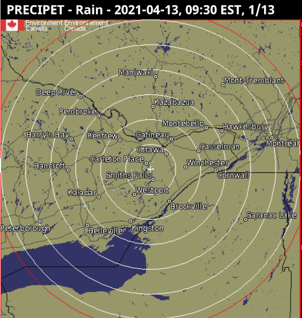
Environment and Climate Change Canada has just revamped the way Canadians view their weather radar (See figure 1 below). Unfortunately the user experience of the new site is two steps forward and five steps backward, particularly for the visually impaired.

The new site (Figure 1, below)  has the following advantages, as compared to the old:

  • The map can be zoomed and panned: the old maps (Figures 3 and 4 below) could not be zoomed and were of fixed areas. On a computer, the map also fills the whole width of the screen to cover more territory (but cannot be extended vertically).  
  • A single composite map: Rather than showing individual radar stations, or provincial composites, it shows a single unified map including all North American weather stations.

There are more options for

The new site has the following disadvantages as compared to the old; I have ranked these in order starting with the most important:

  • Very bad background colours: The old maps (Figures 3 and 4) had vastly better colour contrast between non-precipitation and precipitation; land was brown and water was very dark blue. Light rain or snow was highly contrasted against this, making it easy to see. The new map (Figure 1) uses light blue both for light precipitation and also for water, making viewing the maps hard for everybody, but especially for the visually impaired. The default background is also light in colour. This will not be usable for anyone who is colourblind. Various US-based radar maps (such as in Figure 2) do a much better job, and show rivers and lakes much better too. The new maps have a 'simple' option for background colours, but this is only marginally better than the default, and eliminates useful geographical references like roads. Water features are very hard to see in the simple mode. Solution. Revert to the old background, or use darker colours for the light precipitation. At least allow other choices for background. This should not be hard to do.
  • Compass directions are wrong in local views. The map projection used for all views is "Canada Base Map Transportation". That projection has the advantage that it shows distances and area consistently, a feature useful for displaying the entirety of Canada without distorting the amount of land taken up by the arctic and other northern areas. But for the radar maps there is no northern coverage so the usefulness of this is questionable. Instead the new weather radar projection mean that when zoomed in to a local view in the east, straight up in the map is Northeast, and a horizontal line runs from Northwest to Southeast (opposite on in Western Canada). Directions are only right in Manitoba; in Ontario they are disconcertingly 'off' and in the Atlantic provinces they are totally wrong. This hinders understanding of the incoming direction of precipitation and storms, a critical feature of the weather radar maps. Solution: Either adjust the orientation as the map is zoomed in, so 'up' remains North, or else provide separate local views. At the very least show a compass rose on the maps, since people need to know the direction from which precipitation is coming. 
  • Cannot zoom fully in: The map cannot be zoomed in far enough, as is often useful to see local detail. With the old map the entire browser window could be zoomed in, but this is much harder in the new maps. Solution: Allow several more clicks on the +, or further pinching, to zoom more fully in to show a small local area. This would be extremely useful to see when precipitation is about to approach local features, and can help the visually impaired.
  • Forced scrolling down on the web page to see the map: On opening the page, the map doesn't immediately appear, instead there is a big 'Government of Canada' heading taking up space, and an even bigger announcement 'We have a new weather radar map'. Solution: Use much less vertical space for these superfluous elements.
  • Fuzzy text: Note the lack of crispness in the text for the geographical features in figure 1, as compared to the other figures.
  • No scale. The old maps had a scale.

Figure 1 (below): New Canadian weather radar. Notice the light blue for precipitation near North Bay, that is too similar to the light blue of water. Note that the compass directions are distorted, with Brockville (just at right side of the map) appearing south-southeast of Ottawa, rather than south.


Figure 2 (below): Weather Underground Radar of the same area as Figure 1. Notice the dark contrast for the precipitation, and the visibility of the lakes. Notice also that the international boundary in Lake Ontario which runs east to west is horizontal, and Brockville appears corectly South of Ottawa. Crispness of the map is also better, with little lakes shown more clearly against the background (this often greatly helps boaters trying to interpret incoming storm patterns)


Figure 3 (below): Old weather radar view of Ontario). Still available as 'historical'. Notice the dark background, allowing precipitation to be easily seen. This view has compass distortion; one needs to use the local view (Figure 4) to eliminate that. This view also shows the locations of the radars themselves, which although not entirely necessary, can help people understand the system.



Friday, May 24, 2013

UML in Practice talk at ICSE: And How Umple Could Help

I just  finished attending the ICSE talk by Marian Petre of Open University, entitled "UML in Practice"

She conducted an excellent interview-based study of 50 software developers in a wide variety of industries and geographical locations. Her key question was, "Do you use UML".

She found that only 15 out of 50 use it in some way, and none use it wholeheartedly.

A total of 11 use it selectively, adapting it as necessary depending on the audience. Of this group use of diagram types was: Class diagrams: 7, sequence diagrams: 6, activity diagrams: 6, state diagrams: 2 and use case diagrams: 1.

Only 3 used it for code generation; these were generally in the context of product lines and embedded software. Such users, however, tended not to use it for early phases of design, only for generation.

One used it in what she called 'retrofit' mode, i.e. "Not unless the client demands it for some reason".

That leaves the 35 software developers who do not use it (70%). Some reported historical use, and some of these did in fact model using their own notation.

The main complaints were that it is unnecessarily complex, lacks and ability to represent the whole system, and has difficulties when it comes to synchronization of artifacts. There were also comments about certain diagram types, such as state machines being only used as an aid to thinking. In general, diagram types were seen as not working well together.

She did comment on the fact that UML is widely taught in educational programs.

My overall response to this paper is, 'bingo'. The paper backs up research results we have previously published, which served as a motivation for the development of Umple.

Features of Umple that are explicitly designed to help improve UML adoption include:
  • Umple can be used to sketch (using UmpleOnline) and the sketch can become the core of high quality generated code later on.
  • It is a simplified subset of UML, combatting the complexity complained about in the Petre's research.
  • It explicitly addresses synchronization of artifacts by merging code and UML in one textual form: UML, expressed textually is just embedded in code, with the ability to generate diagrams 'on the fly', and edit the code by editing either the code or those diagrams.
  • It integrates diagram types: State machines work smoothly with class diagrams, for example.
  • Diagrams like state machines finally become useful in a wide variety of systems, not just embedded systems.
I hope that if Umple can become popular, then in a few years, we could do a study like this and report quite different results.

Thursday, May 31, 2012

What's Important in Software Engineering Education articles still having an impact

Over a decade ago I conducted research in which I determined that certain areas of software engineering education are under-taught and over-taught, based on their relevance to the careers of software professionals.

The three articles published from this research continue to be cited and discussed. Just recently Robert Glass and Johann Rost summarized some of my findings in their Dark Side of Software Engineering blog. They invited me to add some of my thoughts, which became part of their blog post. I invite you to read their blog entry by clicking here.

In my original papers, I found:

The three papers from my original research are below; please cite them:

Note that the raw survey data is still available online, and has had over 10,600 hits, suggesting the data is being used quite a bit.

I am planning on repeating the study and comparing the new data with the original. I will add a few topics that have become important in recent years such as web development, mobile development, agile methods, and game development. I will also examine recent curricula for additional items.

If you are interested in helping either as a participant or to help distribute the survey in your company, please email me with the subject line Education Relevance. In the original survey it was extremely useful to receive the assistance of senior managers and HR personnel from several companies. I was able to give those companies sub-analyses relevant to their employees.

In my comments in Glass and Rost's blog, I added a few additional points worth reiterating (these are my opinions, not based on any survey):
  • Central to becoming a productive software developer, in my opinion is practice, practice, practice, but structured so the practice is spread out over diverse technologies, problem types and application domains.
  • There are different sub-contexts for education. If you want to be a quality-assurance expert, you would want to focus on material that would be of much less interest to the 'average' developer; and clearly many of the less-important topics such as calculus will be critical to certain application domains. The survey results should not be interpreted as meaning that all software engineering or computer science educational programs should give uniform emphasis to the same set of topics.
  • The notion of agility is becoming not only important in the work force, but also in education: Educational programs need to become more agile at responding to the needs of students (actually I think the reverse is happening in some contexts where fear of losing accreditation drives decisions). But, even more importantly, having students work on agile projects can, I think, help them learn the most important material they will need. I have found UCOSP student projects very successful in this regard.

Wednesday, May 25, 2011

Live Blog from ICSE: Interesting empirical studies

This is my fourth blog post from ICSE, following on from this morning's post.

The first paper in this session was An Empirical Investigation into the Role of API-Level Refactorings during Software Evolution, by Miryung Kim, Dongxiang Cai, and Sunghun Kim

Conventional wisdom suggests that refactoring improves quality and reduces technical debt. However in this paper, the authors found evidence to suggest that the picture isn't so rosy. The speaker pointed out existing research that shows that refactoring tools tend to be buggy, and are not used properly.

She focused on API level refactorings (rename, remove and signature changes at or above the header level). She contrasted these with bug fix revisions, and non-api-level revisions.

She showed that in the systems she studied there was an increase in fixes after API level refactoring. She said this was a surprise, but it was not a surprise to me since it confirms my coding experience. Half of the problems were incorrect refactorings done at the same as fixing bugs. She found that fix time for a bug is faster if refactoring is done first. This confirms best practice. She also found that despite the concept of 'code freeze' there seemed to be more refactorings and more bug fixes just before major releases.

The second paper was entitled Factors Leading to Integration Failures in Global Feature-Oriented Development: An Empirical Analysis, by Marcelo Cataldo and James D. Herbsleb

The presenter started out by defining what a feature is: Both a unit of functionality in end-user terms, and as managed by a project.

The research setting was automotive entertainment systems; they studied 179 engineers in 13 teams, over 32 months. These people were developing 1.5 million lines of code in 6789 source files.

They studied various technical attributes of the features (changed lines, and various aspects of dependencies) as well as organization aspects.

They measured integration failures, and analyzed the factors that may have led to these. The technical factors that mattered most were the number concentration of dependencies. The organizational factors were geographical distribution of team members, and lack of ownership of the feature by those that also owned coupled features.

A lot of this seems to correspond to expectations, however it is nice to have empirical results that confirm those expectations.

However one non-intuitive observation was that when the number of dependencies reached a particularly high level, a collocated team actually experienced worse results than a geographically distributed team.

The final paper in the session was entitled Assessing Programming Language Impact on Development and Maintenance: A Study on C and C++ by Pamela Bhattacharya and Iulian Neamtiu

The presenter indicated the purpose of their research was to determine which programming language (C or C++) led to fewer bugs, reduced complexity, greater ease of extension and better maintainability. They set out to measure the effect of the chosen language while controlling for such factors as development process and developer expertise.

They cited the http://langpop.com site on language popularity, as well as the Tiobe index, which show use of langauges as chosen by developers, without a formal understanding of which would actually give the best results.

They studied four long-lived open-source projects: FireFiox, VLC, Blender (a 3D suite) and MySQL C++ is gradually taking over from C in the first three of these, but not Blender. The Blender developers told the researchers that they were more comfortable in C.

The researchers tested and confirmed the hypothesis that C++ code was of higher internal quality than C code. They also tested and confirmed the hypothesis that C++ code is less prone to errors. Their final hypothesis, that C++ code requires less maintenance than C code, was also confirmed.

I found these results interesting, since in my mind C++ is vastly more complex than C, but at the same time has better abstraction. It seems abstractions win.

There was an interesting discussion from the audience: One participant pointed out that the type of code suitable for C development may have been inherently different from the type of code suitable for C++ development, thus invalidating the results. Another pointed out the fact that C is less dense than C++, requiring more lines of code to do the same thing, this invalidating some of the metrics used. I am inclined to agree with these criticisms; as is the case in many scientific studies, we have to be skeptical unless rigorous controls are in place, and even then we have to remain skeptical until there are many replications.

Paper about teaching with Umple was very well received at CSEE&T

I presented Umple on two occasions during CSEE&T. The first was in ASEE&T, an academy for professors who would like to learn to teach software engineering. My slides are here (or in pdf).

The second was a paper session in which I presented the following paper:

Lethbridge, T., Mussbacher, G, Forward, A. and Badreddin, O, (2011) “Teaching UML Using Umple: Applying Model-Oriented Programming in the Classroom”, CSEE&T 2011, pp. 421-428. My slides for that paper presentation are here:

Here are some of my observations about teaching with Umple, taken verbatim from the paper:

  • It proved faster than writing on the board to create diagrams, with its textual mode being subjectively at least twice as fast as writing on the board, and the mouse-and-icon diagram entry mode being about 25% faster than writing on the board.
  • The ability to call up diagrams from a list of example files and then edit them was something that could not be accomplished readily in PowerPoint nor on the board.
  • When designing interactively, the ability to rearrange a diagram was extremely helpful, and much faster than erasing part of a diagram drawn on the board.
  • The ability to show several alternative designs for the same problem proved very useful. This ability just requires pasting Umple text or loading pre-defined Umple examples.
  • The ability to take an existing Java program and convert it into a model live in front of students showed them that their programming skills can directly connect to their new modeling skills. This is also something that cannot be done with other UML tools.
  • The ability to generate and run good-quality code instantly helped students see that modeling is not just about pretty pictures. Doing this helped show them in concrete terms what it means to, for example, change a multiplicity or add an event to a state machine.
  • Since UmpleOnline requires only a browser, it can be instantly invoked in any lecture when needed. Furthermore, students can take the same examples and instantly use them on their own laptops, which many now have in the classroom.
    Here are some of the results of a survey of students using Umple, The diagram should speak for itself: Students liked Umple.

    In addition, the paper showed that final exam grades on UML modeling questions improved by 9.4% in the years since I introduced teaching with Umple. The results were highly statistically significant.

    Many attendees at CSEE&T told me they would like to use Umple or a tool like it, and that I seemed to have made a significant advance in helping students understand UML.