Showing posts with label Usability. Show all posts

Tuesday, April 13, 2021

New Canadian weather radar website a user experience disaster. Urgent fixes needed.

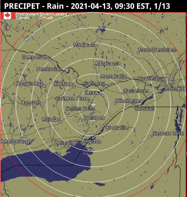
Environment and Climate Change Canada has just revamped the way Canadians view their weather radar (See figure 1 below). Unfortunately the user experience of the new site is two steps forward and five steps backward, particularly for the visually impaired.

The new site (Figure 1, below)  has the following advantages, as compared to the old:

  • The map can be zoomed and panned: the old maps (Figures 3 and 4 below) could not be zoomed and were of fixed areas. On a computer, the map also fills the whole width of the screen to cover more territory (but cannot be extended vertically).  
  • A single composite map: Rather than showing individual radar stations, or provincial composites, it shows a single unified map including all North American weather stations.

There are more options for

The new site has the following disadvantages as compared to the old; I have ranked these in order starting with the most important:

  • Very bad background colours: The old maps (Figures 3 and 4) had vastly better colour contrast between non-precipitation and precipitation; land was brown and water was very dark blue. Light rain or snow was highly contrasted against this, making it easy to see. The new map (Figure 1) uses light blue both for light precipitation and also for water, making viewing the maps hard for everybody, but especially for the visually impaired. The default background is also light in colour. This will not be usable for anyone who is colourblind. Various US-based radar maps (such as in Figure 2) do a much better job, and show rivers and lakes much better too. The new maps have a 'simple' option for background colours, but this is only marginally better than the default, and eliminates useful geographical references like roads. Water features are very hard to see in the simple mode. Solution. Revert to the old background, or use darker colours for the light precipitation. At least allow other choices for background. This should not be hard to do.
  • Compass directions are wrong in local views. The map projection used for all views is "Canada Base Map Transportation". That projection has the advantage that it shows distances and area consistently, a feature useful for displaying the entirety of Canada without distorting the amount of land taken up by the arctic and other northern areas. But for the radar maps there is no northern coverage so the usefulness of this is questionable. Instead the new weather radar projection mean that when zoomed in to a local view in the east, straight up in the map is Northeast, and a horizontal line runs from Northwest to Southeast (opposite on in Western Canada). Directions are only right in Manitoba; in Ontario they are disconcertingly 'off' and in the Atlantic provinces they are totally wrong. This hinders understanding of the incoming direction of precipitation and storms, a critical feature of the weather radar maps. Solution: Either adjust the orientation as the map is zoomed in, so 'up' remains North, or else provide separate local views. At the very least show a compass rose on the maps, since people need to know the direction from which precipitation is coming. 
  • Cannot zoom fully in: The map cannot be zoomed in far enough, as is often useful to see local detail. With the old map the entire browser window could be zoomed in, but this is much harder in the new maps. Solution: Allow several more clicks on the +, or further pinching, to zoom more fully in to show a small local area. This would be extremely useful to see when precipitation is about to approach local features, and can help the visually impaired.
  • Forced scrolling down on the web page to see the map: On opening the page, the map doesn't immediately appear, instead there is a big 'Government of Canada' heading taking up space, and an even bigger announcement 'We have a new weather radar map'. Solution: Use much less vertical space for these superfluous elements.
  • Fuzzy text: Note the lack of crispness in the text for the geographical features in figure 1, as compared to the other figures.
  • No scale. The old maps had a scale.

Figure 1 (below): New Canadian weather radar. Notice the light blue for precipitation near North Bay, that is too similar to the light blue of water. Note that the compass directions are distorted, with Brockville (just at right side of the map) appearing south-southeast of Ottawa, rather than south.


Figure 2 (below): Weather Underground Radar of the same area as Figure 1. Notice the dark contrast for the precipitation, and the visibility of the lakes. Notice also that the international boundary in Lake Ontario which runs east to west is horizontal, and Brockville appears corectly South of Ottawa. Crispness of the map is also better, with little lakes shown more clearly against the background (this often greatly helps boaters trying to interpret incoming storm patterns)


Figure 3 (below): Old weather radar view of Ontario). Still available as 'historical'. Notice the dark background, allowing precipitation to be easily seen. This view has compass distortion; one needs to use the local view (Figure 4) to eliminate that. This view also shows the locations of the radars themselves, which although not entirely necessary, can help people understand the system.



Monday, September 23, 2013

Just because fingerprints can be hacked doesn't make them useless in the iPhone 5S

As this article states, the fingerprint reader of the new iPhone 5S has been hacked by the Chaos Computer Club.

But does that mean Apple is "stupid" as they say, and that fingerprint authentication is unwise?

No, for the following reasons:

  • Right now, many people avoid using passcode locking because it is slow. This method will encourage them to lock their phones because it is faster to unlock them.
  • Passcode locking is almost certainly less secure than hackable-fingerprints due to the possibility of people looking over one's shoulder.
  • The average thief who decides to keep a lost phone they found or mugs someone and runs off with their phone generally won't have time to perform sophisticated fingerprint forging before the owner of the iPhone locks or wipes their device remotely.
  • It improves accessibility for the blind.

The lesson is that we should approach security from several directions. Avoid keeping critical information in plaintext on any computer or phone, protected by just one method. Use two-factor authentication, obfuscation, and passwords/passcodes in addition to fingerprints for such data. Also arrange for remote wiping in advance.

I have other suggestions for Apple (and others thinking of using this technology).

  1. Use geofencing. As an option, allow fingerprint-only access when in the home or other places that the phone recognizes it spends a lot of time; it could 'learn' the users workplace geographic coordinates, but require the passcode when elsewhere.
  2. Allow longer time intervals for passcode-required access. Currently the passcode can be required immediately, or after an interval has passed, with settings p to 15 minutes. The only other alternative is 'no passcode'. However, an interval of half an hour or an hour or even a day could be very useful too, to deter theft, especially in conjunction with geofencing and entry of an Apple ID for changing the passcode.
  3. Keep developing biometrics: Fingerprint recognition combined with facial recognition and/or voice recognition could double the difficulty of hacking. For example, with both fingerprint and facial recognition (both instant) a hacker couldn't just lift a fingerprint without also obtaining a photo of the user. That would require knowing whose phone it is. 

The idea is that someone reluctant to enter their passcode very often might be more willing if it was required only once in a while.


Thursday, August 16, 2012

Apple Time Machine backups should not delete oldest, thin to monthly when space becomes short

The new version of the Time Machine backup capability in Mac OSX Mountain Lion has important improvements.

Most notably it transparently allows one to use multiple disks for backup. I use one backup disk at home and one at work. These allow me to be more confident that if one disk crashes I still have the other, and wherever I am working, I have an hourly backup to fall back on.

However here's a suggestion for the next improvement Apple could make: Currently the policy for maintaining backups is (quoting directly from the Time Machine control panel shown below):

  • "Hourly backups for the past 24 hours
  • Daily backups for the past month
  • Weekly backups for all previous months

The oldest backups are deleted when the disk becomes full."

My suggestion is this: When the disk becomes full, older backups should be thinned to monthly (up to three months ago) starting with the oldest. Weekly backups should always be retained for three months.

So if the disk becomes full, it should not delete the oldest backup, instead it should delete the second-oldest, and what was the third and fourth oldest, leave the what was the fifth oldest, and delete what was the sixth oldest, etc.

Why? Sometimes missing files can only be retrieved from deep history. With monthly backups far back in time, one has a pretty good chance of being able to retrieve such files. Weekly backups several years old are likely not needed.


In my experience I have retrieved lost work from Time Machine about 3 times a year. Not much. However, backups are all about insurance and peace of mind. Who knows when I will have a disk crash or do something catastrophic to my documents.

This post updates my earlier post on backups. Note that I no longer backup to Mobile Me since it has gone away. Some of my data is backed up on iCloud, although I personally feel it is critical to maintain one's own personal backup of cloud-stored data. I still back up using SuperDuper periodically in addition to Time Machine, although now I have two Time Machine disks, I will be updating my SuperDuper partitions less often.

Thursday, February 23, 2012

Distracted driving and cellphones: Technological solutions to avoid overreactive bans

Distracted driving is clearly a critical safety concern, however I believe that banning use of cellphones is a major overreaction.

Yet that is precisely what the US National Transportation Safety Board and several other organizations are pushing for. They are not just talking about texting or hands-free use, they are talking about banning all non-emergency calls even with hands-free technology.

Their key argument seems to be this: Unlike talking to a passenger (who can also see the road and recognize when the driver is in a situation where they need to ignore the conversation to pay higher attention to driving), or listening to the radio (which is not interactive), talking to a remote caller is particularly distracting since the caller will keep on talking through critical driving situations, and drivers will tend to feel compelled to maintain the conversation.

That may be the case. However rather than a knee-jerk ban, I think that it would be better to impose requirements for a technological solution. Here's what a cellphone should be capable of doing, within a few years.

  • Within two years: Notifying the person at the other end of a cell-phone conversation that the call is from or to a vehicle in motion: This would be relatively easy using GPS and accelerometer date today. The phone could simply inject into the conversation when the call starts, or the vehicle starts moving, or after a prolonged stop, the spoken words, "vehicle in motion". People would get used to it. It wouldn't solve all problems but it would be a first step. It might he hard to distinguish between a passenger talking vs. the driver talking, but a passenger could easily explain the situation.
  • Within 5-7 years: Interacting with upcoming vehicular technology inject a warning, or in extreme cases suspend a call, when indeed a driver is facing a difficult situation. For example the phone could take such an action when it detects the dense fast-moving traffic, an accident-prone zone, slippery roads, low visibility, accidents in the area,  potential rapid-braking requirements ahead, or indeed the driver or the driver of a nearby car behaving in a way that shows tiredness or distraction. At this level of technological development, the phone could also detect what area of the car it is in so as to know whether it is in the hands of a passenger or not.
  • Within 10-12 years: providing a video link to a camera facing forward out of the car's windshield so the caller can see the conditions on the road.

I think part two of my above proposal could in fact help actively reduce accidents, since the driver himself or herself would also hear the warning. All three of the above could in turn become requirements, as technology develops. Phones could be certified as 'distraction-reduction enabled'.

I used CB radios in the 1980's. Truckers and many other commercial drivers have used such 2-way communication devices for decades. Cellphones are only different because the person at the other end may be someone who is not also a driver, or aware of the driving context. My suggestions would largely remove that argument.

Talking while driving can have several important benefits.

  • It can keep the driver alert on long stretches of highway driving.
  • It can allow the driver to make better plans, which can sometimes improve safety.
  • It can allow drivers to communicate their status to others which can be helpful in many ways.
  • It is needed in many lines of business, where people need to talk with dispatchers, or decide where to drive to based on a changing context. Spoken communication is almost certain to be better than information appearing on a screen.
  • When lost, having someone guide you to the right place can be very valuable. Lost drivers are likely to be particularly distracted as they deflect their ideas to look for address numbers, 

And there are many other sources of distraction on the roads:

  • Use of GPS-based navigation devices
  • Talking to children or blind passengers, who be as less aware of context like external callers
  • Changing channel on the radio, or the heating controls, or other aspects of our ever-more-complex vehicle controls.
  • Drinking to keep hydrated and maintain one's caffeine levels; eating snacks. Being hungry and thirsty presumably can result in their own source of distraction, so we wouldn't want a complete ban on doing these activities.

There is no technological solution to rowdy kids or the need to drink a coffee. But there can be for the distractions worsened by technology itself.

I am completely in favour of a rigorous ban on texting, and strong restrictions if other devices that require deflecting the eyes or using the hands. In this regard, user interfaces and accuracy for voice-driven calling and voice-output on navigational devices needs improving. For example, I find my iPhone 3GS normally fails to call the correct person or play the right song when I use Voice Control (maybe it is my half-British accent). This should be an area of urgent focus for UI improvement. I would like, to have a few preset commands, 'call home' being the most important, that would be ultra-reliable.

I can see an argument for 'cell-phone' free zones or conditions (bad weather, heavy fast-moving highways, complex inner-city road layouts, etc). But the outright ban is over-reaction.

I can also see an argument for greater limitations on cell-phone use for new drivers (akin to zero-alcohol policies, and limitations on night driving). Various jurisdictions now also require driver re-tests for seniors above a certain age. Perhaps limitations on cellphone use could be integrated with such requirements. It would likely be possible to devise speed-of-reaction or distractibility tests. It is clear that as we age, or ability to multitask diminishes. On my license I have a requirement to wear eyeglasses because I couldn't pass a vision test without them. Perhaps I could have a requirement to not use a phone if I can't pass a multitasking test.

For an earlier post on my predictions for smart phone capabilities, see here.

Wednesday, November 23, 2011

In fear of the great Google Shutdown train: What could be next?

Google has been in a frenzy of 'cleanup' activity over the last few months. It is beginning to make me feel positively uncomfortable.

Google's latest blog post announces the shutdown of a number of services that are not doing well, notably Google Wave and Knol.

I think it is the latter that alarms me the most. They point out that the proposed replacement for Knol is WordPress based. Yet they have their own Blogger service (which you are using right now to read this) that competes against WordPress. Does that mean that the writing will be on the wall some time in the future for Blogger? It certainly makes me think about moving this blog elsewhere.

In addition to Blogger, I am heavily invested in Google Code for the Umple project. Will Google Code be on the chopping block too at some point? After all, like Blogger it is a service that Google provides on a largely public-service basis. Google is already shutting down 'Code search' with no announced replacement, and has severely limited the usability of Google Groups, as I have previously commented.

I think that if I had read all these announcements a year ago when I was first starting blogging and open-source development, I would likely have chosen different platforms. I imagine many people just setting out to use such online services will think the same thing. I chose Google because it is a large company with a reputation for stability, innovation and beneficence. Two of my factors in choosing Blogger and Google Code over WordPress and GitHub were the integration with Google accounts and Google search. However long-term stability trumps all. Using Google services puts me at the mercy of Google Shutdown.

I will persist with Google for now, hoping their 'Do no evil' mantra wins out in the end. However, I am continuing to take steps to protect myself. These include making all links to the Umple project go through the umple.org domain, so I can relocate them if I had to, and regularly backing up my subversion repository and blog. I will be looking into mirroring my blog on a domain and server I have full control over.

I also hereby ask Google:

  • To make formal 10-year service guarantees for its services in which people invest huge amounts of personal time, like Google Code, Blogger and  Google Groups.
  • To extend these guarantees each year, so any potential shutdown would always be 10 years out
  • To publish usage statistics trends of its services so we can be confident that we are using services that are not dwindling in numbers of users.
  • To keep data in shut-down services visible in a read-only manner without limit  (e.g. keeping Knol URLs active for reading indefinitely, so links that point to them never go stale). There would be very little cost in doing this.

I think that unless Google does this, more and more people will migrate away, and fewer and fewer new users will adopt these services, resulting in a self-fulfilling prophesy of shutdown due to low usage.

And lest people think I am being unfair to Google, or risking having Google push me personally off its services for criticizing it, I have been just as critical of Apple, and have not even ventured near Microsoft's online services since they have historically been too closed. Google is still an excellent online service provider for blogging, open-source code hosting, and mailing lists, and is still probably a lower risk than smaller companies regarding potential shutdown. But overall, I now do not consider it a low risk in this regard.

Also in defense of Google, they do make their announcements in a reasonably friendly way and try to suggest alternatives. I do wish in their announcements they would tell us the number of users they estimate to be affected (both content providers and readers).

Wednesday, November 16, 2011

Give downloadable files more meaningful names


More and more websites give the option to download a files containing such things as bills, software installers (or source code), receipts, posters, brochures, e-books and reports. Once downloaded, people need to file these for extended periods.

Unfortunately it is common for the downloaded files to have meaningless names such as 'Document', 'Results', 'File', 'Report', 'Data', some arbitrary internal identifier, or other names that are not as helpful as they should be.

I propose the following general guidelines for downloadable files. Any downloaded file name should include:

  1. Some way to identify the file's origin, such as the company name or website
  2. Some succinct way to identify the type of content, such as 'bill', 'receipt', the software product etc.
  3. The date. Files stored on computers have a date created by the operating system. But this is not part of the filename  and is reset when you copy or edit a file. When the date is intrinsic to the data in a file, such as the date of issue of a report or receipt, the month of a bill, the release date of software or a press release, etc. then this information should be part of the filename on a permanent basis. Very few downloaded filenames have the date. The date should be in yyyy-mm-dd format to facilitate sorting by date. The date should be the date the date being sent was created, not the date of download. If it is a monthly report, always issued at the end of the month, then the day can be omitted.
  4. If appropriate, a version number. Many software downloads have this, but too many do not.
  5. If necessary, some way to ensure downloads of the same type but with different content are distinct. For example, if you are an avid sports fan and regularly download spreadsheets with sports statistics, you might want the time to which the data is valid, not just the date, as part of the filename.

For example:

  • SurveyMonkey's downloads appear as 'Results.zip'. When you unzip the file, the internal contents are a little nicer, for example 'SurveySummary_' followed by the date at which data was last updated. However, there is no way to distinguish among the various different surveys I am running, nor the filters or collectors I have applied when generating the data.
  • A recent download of Silverlight just said 'Silverlight.dmg'. There was no version number or release date.
  • The paystubs I receive from my employer say 'paystub' followed by a serial number, but do not identify the date of the pay in the filename.
  • A report I downloaded from the CRTC yesterday (subject of a future blog post probably) at URL http://www.crtc.gc.ca/eng/archive/2011/2011-703.pdf resulted in a filename that just has the year and a serial number, and no identification of its source (CRTC) or content.
  • When I download my Rogers bill from EPost it says 'RogersBill', but does not include the month of the bill. RogersBill-2011-11-15 would be better. Adding the account number on the end, or perhaps the account-holder's name, might also be useful to account for situations where people have to manage the bills for several accounts. I would even go as far as to tack on the bottom-line total (dollars spent or owning) to bills, receipts and other forms of statements. When later reviewing a long list of receipts, for example, this can prove extremely useful.
  • When I download an investment report from my investment company, it just says 'ClientReport.pdf'. The company, date and content description are missing. Here, the name of the investor would also be useful, to handle situations where one is downloading reports for different family members.

And on and on. In all these cases, people are forced to edit the filename after download. I can't count how many times I have found a file in my downloads folder and had to open it to remember its contents before editing its filename and then putting it in the correct place in my disk.

This aspect of usability seems to be overlooked by a very high percentage of software engineers and web designers. All the designers seem to think about is the content of the files, and perhaps the URL and the location of the file on the server. They forget that the file will have a life of its own and need to be identifiable once it leaves the server and resides on a client's computer.

One can, of course, go to far. The filename must be kept to a manageable length; at one time the absolute maximum was 8 characters in DOS (not including the extension), then 32 characters, and now typically about 255 bytes (which means fewer than 255 characters if non-ASCII Unicode characters are used). A human-usable limit is, I think, about 60 characters. There is a useful Wikipedia page describing the absolute limits and the characters that can be used. The following are some fictitious examples of meaningful download filenames that are kept to a reasonable length, adhere to the guidelines above, and are hopefully self-explanatory.

  • TeledirectCableBill-2011-11--66.13--acct9876543.pdf
  • Supersoft-FuriousCowsInstaller-2011-11-16-v1.2.3.dmg
  • GovNY-TaxLaw-ProposedChgs-2011-11-16-rpt87924.pdf
I recommend not using spaces in names to make it easier for certain programs, and shell scripts to process files. CamelCase and hyphens are useful to separate elements.

Related situations

If the ability to download a pdf file is not available, it is common for people to save bills, receipts, and similar documents using various 'print to pdf' capabilities, such as those built into the MacOS X print function. In these situations, the created pdf file will have a name derived from the html page's title. All rules I described above should therefore also be applied to the html title for pages that are commonly printed (bills, receipts, etc). I would go so far as to use a filename convention without spaces in the title of such html pages, specifically to facilitate one-step printing to pdf.

When emailing files to people, many senders just grab a file from their filesystem and add it as an attachment. People should get in the habit of giving meaningful names to files when they store them in their filesystem, and not just rely on identifying the file by way of its location in the filesystem; that helps prevent sending attachments with meaningless names. All too often I have received and had to save attachments with names such as report.docx.

Even when sending JPEG or other media files, the naming convention comes into play. I love the Olympus style of naming jpegs that embeds the date of the picture and a serial number right in the filename, e.g. PB171234.JPG for a picture stored in the 11th month of the year (B), on day 17, and with serial-number 1234. Many other cameras use filename formats that are not nearly so useful, like IMG_9999.JPG (see this Wikipedia page for naming convention details). In fact, the file naming convention alone is enough to tilt me towards a certain brand of cameras. When sending or uploading images, people should also consider adding description of the contents to their filenames. All this metadata can be stored using EXIF attributes, but most people aren't sophisticated enough to browse using tool that is EXIF-savvy.

I note with interest that even my own projects are sometimes guilty of inadequate names for downloads. For example in UmpleOnline, you can download a directory of generated code. The download has a name like 'JavaFromUmple.zip'. The source is identified (Umple); the content is identified (Java), but neither the name of the model nor the date and time are currently identified. Both of the latter would be useful. We will work on this problem.

Friday, September 9, 2011

Mac OS Lion irritants that Apple should fix

When Mac OS X 10.7, otherwise known as Lion, first came out, I published a series of reviews.

Here is an update after about 45 days of using Lion.

Overall I still find Lion an improvement to snow Leopard, but only just.  I have found myself using the optional new features less and less. For example, I practically never use Mission Control and only occasionally use LaunchPad. The 'compulsory' new features, such as the change in scroll direction, and the new look of Calendar and Address Book, remain more negative to me than positive. I have continued my practice of turning off 'Natural' scrolling, for example.

Although in my earlier post I rated Autosave and Versions highly, in a months use I have actually found details of their current implementation to be very irritating. I will explain why below.

The thing that probably saves Lion, for me, and results in considering it a marginal improvement, is my confidence that backups are now being done when I am away from my backup machine.

Here is a list of what irritates me about Lion. All of these things could be fixed easily in a future update of Lion. Hopeful Apple will take notice:

1. Stability: It is normal in a new OS version to have stability problems, but Lion is worse than normal. I have had about four OS crashes, which is considerably more frequent than I experienced in the last few years with Mac OS. With Snow Leopard, I experienced about one OS crash every 8 months. I would leave my computer running (or in sleep) for months on end. I have also had nasty crashes in a few applications, most notably NetNewsWire, which now crashes over and over again every few days, probably when some malformed RSS item appears. This started occurring the day I installed Lion and has ever since.

2. Slowness due to firing up attached hard drives. If external drives are attached and sleeping, Lion and its apps now sometimes insist on spinning them up to speed, displaying the 'beach ball' while doing this. That delays one's ability to do work, and never happened in Snow Leopard.

3. Lion won't sleep when a second screen is attached: I usually work with two screens, my laptop screen and an attached larger screen. In Snow Leopard, closing the lid would cause sleep. Now, if the second screen is attached, closing the screen results in that second screen taking over as 'main screen'; sleep does not occur. This is highly irritating, and I haven't been able to find a way to deal with it in a satisfying way. The workaround is to remember to unplug the second screen before closing the laptop, but that should not be necessary. Apple should have a preferences option allowing users to choose which laptop-closing behaviour they like best.

4. Drag and drop in Finder is harder to do: Apple has made drag and drop more 'fancy' by adding graphics and animation to the set of items being dragged, however this makes it more difficult to position the cursor accurately over a small target, resulting in items being all-too-often dropped in the wrong place. The subdued colours in Lion also make it harder to see whether the target is selected. A good solution would be to animate the target, when selected, making it grow in size, like the dock does.

5. Sideways signatures: The 'signature' feature in Preview is cool. I like being able to sign documents electronically using the web cam. However it has one weakness. It won't allow you to rotate the signature. If someone sends you a scanned document sideways and the pdf file thinks that 'up' is one of the sides, then Preview will insert the signature sideways. There needs to be an option to rotate the signature when placed on the page. Rotating the pdf file doesn't solve the problem. The current workaround is to print the pdf file to pdf. You get an identical file, except that it now knows which way is up!

6. Restart/restore needs per-application control: One of Lion's key 'features' is that it restarts open applications and reloads open files upon restart. But the fact that there is no way to fine tune this is just plain annoying. It is possible to turn it on and off entirely. What is needed is an ability to turn resume and file reopening on and off for specific applications. Why? Applications like Word and Excel open a blank page when started. This just gets in the way when rebooting. With other applications, like Preview and BBedit, one way to clear out tons of open files was to quit.  With applications that do things like maintain a network connection, it makes no sense to start them until I am ready to connect to that network service. But I don't want to turn the feature off entirely since it is quite useful in a few apps.

7. Autosave and versions disrupts workflow and causes crashes: Although I gave autosave and versions an A+ in my earlier post, I have come to dislike the way one is forced to use them. Currently they are only available in Apple apps and certain third-party apps. My experience is with Preview. One of my main workflows in Preview is to work through a long list of JPEG files, adjusting them in rapid succession. Autosave has a hard time keeping up; in one case I was taking less than a second per file to reorient a whole load of files, and was working faster then autosave could keep up. Eventually Preview crashed. Another workflow I use extremely often is to take a document, modify it and then save the modified version with a different name. In Apple's new setup you have to 'export' a version and restore the original file, or remember to make a copy first then modify that copy. Sometimes you don't know until you have made a few edits whether you want to create a new file out of the old, or apply the edits to the original. There needs to be a 'Save as...' menu item that will make a new file with the changes, and by default, restore the original file to how it was.

8. Calendar event entering is subpar: I find that Calendar's method of interpreting free-form text to make a calendar entry doesn't work well, particularly since I always need to open the dialog to set other fields anyway.  How about popping up a non-modal dialog with all the available fields if you hit enter without typing anything.

9. File renaming is more awkward in Finder: When you rename a file, it momentarily flashes the old name. This is a visual annoyance more than a functional one, but gets in the way mentally when doing a lot of renames.

In addition to the above, I have started using Safari as my main browser. I used to use Firefox. The following are the irritants in Safari that Apple should fix:

10. Remembering passwords is modal: In Firefox, the 'remember password' feature works nicely. After you enter a userid and password into a website, Firefox transmits the information and you get logged in (or not if your credentials are wrong). Only then are you required to confirm that you want Firefox to remember the password. Safari, on the other hand, has a modal dialog shown below: You are forced to confirm remembering the password before you get to see whether you got it right. This is absurd. It also adds delay. I have well over 100 passwords, so password management to me is very critical, and my memory often gets it wrong. I really want to know that I got it right before confirming that to Safari.


11. No memory of larger font: I often use command-+ to make the font bigger, so I can read text more comfortably. Firefox remembers, on a site-by-site basis, when you have done this. That is an extremely nice feature. When I am reading a news site, each page appears with the font size I have selected in the past. Safari, however doesn't remember this information, so I have to command+ every page I visit. Incidentally, Internet Explorer on Windows seems even worse, often not remembering font size when using the back button.

Thursday, September 1, 2011

Hardware with usability problems: Dyson Airblade hand dryer

Most of my usability posts are about software, but from time to time I will comment about usability issues in other aspects of life, such as machines and buildings.

The picture below shows the Dyson Airblade. This is a new kind of hand dryer popping up more and more in public washrooms. I hate them. Please, if you are installing a washroom, don't choose this technology!

This technology uses high speed jets (blades of air) to rapidly push the water off your hands. You insert your hands from above. The water is 'pushed' rather than evaporated. It works, if you are an able-bodied adult with steady hands.


The big benefit of the device is lower energy consumption.

What are the problems:

  1. They are totally unusable by small children. You have to insert your hands from above. Small children simply cannot reach the slots. In many washrooms with these devices there is no alternative, so kids have to leave their hands wet. My four-year old cannot use these yet; she is short and likely will only be able to use them when she is 6 or 7. This is unacceptable.
  2. Disabled people in wheelchairs cannot use them. This is a critical accessibility problem.
  3. People with Parkinsons, or unsteady hands in general will always find that they end up touching the yellow borders of the device. This is unhygienic. Dryers should not require touching anything because not everybody washes their hands well.
  4. Even people like myself and my wife don't like them because of reason 3. I have steady hands, but it it requires attention to avoid touching the borders; not easy, for example, if you have little kids in tow.
I don't see an easy way to fix this without major redesign. They could somehow arrange for an additional set of hand slots much lower down, to solve problems 1 and 2. However that would increase the cost a lot. To solve problems 3 and 4, they would need to increase the openings a lot, but that would decrease the effectiveness. Perhaps some kind of mechanism could automatically move to avoid having the device touch people's hands, or perhaps it could be redesigned so people insert their hands up to their sleeves, so only their sleeves would touch. A moving element could then push the water with the blade of air. However, this all seems very difficult to achieve inexpensively from an engineering standpoint.

If you agree with the above, please forward to the company, to building supervisors and to your friends. The corporate website has a feedback form  Let's try to get a movement going against this device until it is redesigned to solve the above problems. Such unaccessible devices are totally unacceptable.

Tuesday, August 30, 2011

Stores should have apps to locate products on their shelves

Here's an idea I have wishing was implemented for many years:

How many times have you visited a grocery store or hardware store and had a hard time finding needed items? It may be because you are unfamiliar with the store's layout, or because the items you want are obscure, or can fit into multiple categories. I find the problem particularly pernicious in huge hardware stores, when you are looking for items you may only ever buy once, and have no idea how the store is arranged.

Therefore, in every grocery store or hardware store, you should be able to search to determine if the store stocks the product and exactly where it is located.

This would be an ideal mobile app. Your Android or iOS device could quickly lead you to where a needed product is located. Furthermore, you should be able to plan your shopping on your home computer even before leaving to go shopping.

The challenge for store owners would be indexing their shelves, assuming they don't already do this for inventory-management purposes.. However consider the following analysis. Imagine a typical grocery store: Shelves have to be stocked constantly, and staff have to be knowledgable about where items are located. A certain amount of staff time is dedicated to helping customers find items. Also, customers would be attracted to a store with a good index, since they would be able to more rapidly locate items. All this argues in favour of it being a net-postive investment to have staff index shelves.

How much time would staff need to index shelves? Imagine there was a device available that could scan bar codes and using enhanced GPS, automatically enter the location into the store's index. Imagine then that someone could scan one product type every 10 seconds, and there are 6 product types per meter of shelf space, five shelves high, and 250m of shelves in the store overall. That would result in the 7500 products being indexable in about 25 hours of work - only a little more than half a work week. If indexing were redone only every 3 months, then the overhead would be 1 20th of a full-time-equivalent person. The indexing overhead could be reduced even further if it was tied to the restocking process (whenever someone is restocking the shelves, they scan the item).

Interestingly Tesco in the UK is making it possible for people to plug their iPad's into grocery carts! Why to add search to this.

The possibilities for enhancing this service are endless:

  • People could create a customized list of the products they buy (perhaps by scanning barcodes), and then check off the items from this list that they have run out of. The system could then give customers an optimized route through the grocery or hardware store that would lead them to pick up each item in sequence, alerting them to when they have arrived at the location where needed items can be found on the shelf. This would make shopping significantly faster. I suppose it would also reduce impulse buying, which may be one reason such a system has not yet been deployed.
  • If this mechanism were standardized across the industry, and a database of current prices was also maintained, people could do zero-thought comparison shopping, create multiple customized lists, allowing them to visit the shelves of several stores to achieve the overall lowest combination of prices. Of course, this would increase competition, and result in downward pressure on prices, which may be another reason why such a system has not yet been widely deployed my merchants.
  • Even if a store itself doesn't maintain such a database. perhaps an external enterprise could do it for the stores in a given city. The cost would be low enough that a low subscription fee ought to pay for the service. I would be willing to pay, for example $20 per year for access to indexes of the 10 grocery and hardware stores near me. It would require 750 subscribers to break even if someone is employed at $30,000 per year and full indexing is every three months. However if indexing was done in full only yearly, with incremental indexing for seasonal items less frequently, then costs could be substantially reduced. Of course, stores may raise legal challenges, asking people to leave who are not buying. However, all it would take would be fore one or two stores to allow indexing before the others would have to permit it, lest they be left out.
  • And what about crowd-sourcing? If enough people sign up to index a few items using their smartphones, every time they go to a store, the indexing problem may be solvable at a very low cost.
The user interface for search in such a system would have to be well designed. Many products have near synonyms, or are hard to spell. For example a search for 'spaghetti sauce' should find pasta sauce as well, and a a search for 'spagety source' should also find it, since not everyone can spell.

Other challenges relate to creating usable shelf maps with precise-enough positioning information. However I strongly believe that these are technology challenges for which good software engineering can really provide the solutions, and for which the hardware embedded in today's mobile devices would be sufficient.

There are some people already working on this kind of application: For example this article talks about ongoing work at the University of Washington, outlining some of the challenges. This article talks about planograms, which are the shelf maps that are already in use in the industry to assist with product placement.

Friday, August 12, 2011

Google dramatically lowers usefulness of Google Groups: One can no longer add members directly

I manage a mailing list for my community.

Street representatives report new people or email address changes to me, and I add them to our community mailing list, so we can keep people informed of emergencies, changes to city services, community events, meetings. etc.

At least, that is how it used to work.

However, in their infinite lack of wisdom, Google have recently removed the ability to add members to a Google Group directly. One now has to 'invite' people.

What is so bad about this, from a usability perspective?
  • People just want to get emails, they do not care what system manages the list. However with the invitation mechanism, people have to associate themselves with Google in a formal way. Many people just don't want to do this. People have simply refused to join the list through the 'invitation' mechanism since Google has led them to set up an account.
  • Many invitation messages just go into people's junk folder, or are ignored as administrivia, even though people have actively given us their email address, and really do want to receive our messages.
  • Often I have a batch of emails to add, and I add them just before sending out an important message. Now I can't do that, since people may take many days to get around to accepting the invitation (if they accept it at all).
Google claims they did this as an 'improvement'. They say "based on feedback we have received from you; we hope they will improve your discussion experience". That is nonsense. We have absolutely never received any spam on the list. Furthermore, there were very string mechanisms already in place to stop abuse: You could only 'directly' add a few members at a time (something on the order of 30). And Google knows who you are, so if you send spam, you are in trouble. Furthermore, you had to have an account in good standing to manage a group and invite members, and as with all Google accounts, it has to be connected to another account (e.g. one provided by your ISP).

Perhaps there has been some abuse. I suppose in the old mechanism, a spammer might have been able to set up an account somewhere else in a false name, then create a Google account with the false account, and finally set up a group and laboriously, over many days, build up a list.. But it would have been utterly impossible to send any useful number of spams that way.

There are mechanisms for sending millions of spams; the old 'add directly' mechanism would have just not been worthwhile for serious spammers.

I think the change must have been prompted by one of the following:
  • Google may have been attempting to force people to create accounts so they can get them to use their services. Is it a coincidence that this change coincided with the introduction of Google Plus? (I will have more to say about that service in a future post).
  • Some isolated spam cases may have reached the attention of a few people at Google, with Google engineers or managers not realizing how the change would hurt so many other people (a classic example of inadequate usability analysis, and not considering unintended consequences).

I invite people at Google to contact me, and I urge them to restore this important function.

As companies get larger and more powerful, running roughshod over their customers in terms of usability has become ever more common. Google used to be top-notch in terms of usability, That is beginning to slip: Little details like this, with big consequences, are becoming more common. The same is true with Apple. I have posted several entries (such as this one and this one) about critical weaknesses in Apples' usability. There is no excuse for this in such large corporations.

Tuesday, August 9, 2011

My predictions for future smartphone technology

We've seen an incredible rise in smartphone technology in the last few years.

The most impressive advances in my opinion have been:

  • The precision of the touch screens. We have had touch screens on phones for many years. I used to use my Palm with my finger when I couldn't be bothered to get out the stylus. The difference in the last few years has been the ability to track finger movement with high precision and in real time.
  • The software. With my Palm of five years ago, there were some things I could do that I still can't do on my iPhone, but the overall experience of the latest generation of mobile OS's has been extraordinary
  • The integrated hardware: Bringing together a GPS, accelerometer, gyroscope, two cameras, digital signal processing, wifi with the ability to serve as a base station, bluetooth, high resolution screen and high speed CPU have provided incredible synergies and opportunities for software writers.

Lots of pundits are discussing what the iPhone 5 will bring to the iOS platform. However I am interested in predicting what will be integrated into mobile phones in five or ten years from now. Below are some of my predictions. Note that I am not mentioning very near-term capabilities like near-field communication (e.g. for payments) that we pretty-much know are coming.

1. Chemical sensors: There has been a lot of recent development towards small devices that can detect minute amounts of chemicals in the air. Devices that plug into the iPhone are already available (or see here and here).  My guess is that we will see these integrated into all high-end smartphones in 10 years, if not 5. Furthermore, I predict that they will have capabilities as good as a dog's before too long. Imagine the possibilities;

  • Smelling to detect dangerous chemicals in the environment and warning you and others.
  • Instant personal breathalyzer: Probably a few lives saved.
  • Diagnosis of diseases. Medical practitioners will be able to make hugely beneficial use of this, but so will ordinary people. Your phone could alert you about what kind of sickness you have, by analyzing your breath. Or it could warn you to stay away from others who might be contagious.
  • Telling you if food is bad
  • Recognizing flowers, perfumes and even people and animals by smell.
  • Telling you the humidity level
My feeling about the probability of iOS phones having such capabilities in 10 years? 60%

2. Pressure sensor / altimeter. These have been available on discrete GPS units for some years. Inevitably they will find their way into iOS and Android phones. They will be useful for navigation (GPS signals are much less accurate in the vertical dimension) but also warning of weather changes.

10 year-probability? 90%


3. Laser: This can be used as a pointing device, but it could have many more useful applications. It can be used to accurately measure distances (such devices are already carried around by real-estate agents to measure rooms). And as this article shows, it can also be used to add to the power of the chemical sensor I discussed above. It could also be used to aid in image stabilization in the camera.
10 year-probability? 75%

4. Broadcast Radio Reception, both FM and digital. It is a waste of bandwidth to send duplicate streams to everyone who wants to watch live events when there are broadcast signals available.  Some iPods already have FM radio; I would love this capability since I always feel a little guilty listening to CBC radio over the Internet (in terms of bandwidth) when there is a perfectly good over-the-air signal. In countries where there is a transition to digital radio, such as the UK, I think the devices will be able to receive such signals too, and perhaps even digital shortwave.
10 year-probability? 100%

5. Broadcast TV Reception: This naturally follows from the last point. This might be the saviour of broadcast TV. Once the tuner is in the phone, it can become a PVR as well. I think mobile TV will first appear on devices, but I also think they will be able to receive regular broadcast TV.
10 year-probability? 99%

6. Highly accurate voice-to-text and voice recognition. Voice-to-text on the iPhone is dreadful. My phone often tries to dial the wrong number. However inevitably this will improve, I think the ability for the phone to detect who is speaking (on the phone and its user) will also be integral, This gives rise to lots of security benefits: You could tell the phone to not respond or to send some form of alarm when an unrecognized user tries to use it.
10 year-accuracy? 98% correct text-to-speech.


7. Integration with cordless phones in the home. When I walk into my house, my phone should be able to connect to my landline as a cordless phone. Although many people are getting rid of landlines, they are still very beneficial from the perspective of avoiding the need for ever larger numbers of cell towers. They also provide a natural in-home conferencing ability. I think a future generation of DECT will be found on mobile phones, and when you buy a base station, you will either buy a few smartphones along with it as your remotes, or else just not bother and use your existing smartphones.

10 year-probability? 90%


8. A camera as good as any of today's mid-range SLRs: The advantages SLRs will retain are interchangeable lenses, a viewfinder, a large lens for low-light applications, and discrete controls facilitating ease of use. However, for pure available-anywhere picture-taking, phones will start to be used by professional photographers. Point-and-shoot cameras will disappear from the market.

10 year-probability? 95%

9. Integrated forbidden-action controls: A standard will be created whereby a business that wants to ban photography or an entertainment venue that wants to ban all kinds of recording as well as accidental sounds, will be able to set up a transmitter that will broadcast its requirements within the premises. Mobile devices will be programmed to obey these directives; it will be possible to scan devices upon entry to confirm to the proprietors that a device is compliant. Although there will always be people who oppose this, it will actually be good for most of us: I don't want a requirement to leave my phone at the front desk of a company, just because it has a camera. Hackers will take joy in overriding these controls, but for most people, they will make life simpler.

10 year-probability? 80%


10. Microscope / telescope: The continued ability to jam more pixels into camera sensors will lead to the ability to digitally zoom to ever greater levels. Combined with well-designed macro lenses, this could enable phones to serve both as microscopes (perhaps to 10x) and telescopes.

10 year-probability? 98%


11. Real-time facial recognition: We are seeing facial recognition rapidly invading out lives. Phones surely will be able to do it. If you forget who someone is, you could discretely point your phone at them (if you can figure out a way to do this discretely). I will have more posts about facial recognition in the near future.

10 year-probability? 99%


12. Integrated special-purpose chips specifically to boost artificial intelligence capabilities: These might be neural net chips or something similar. We have special-purpose graphics chips already, so I don't think this is too far-fetched. They could be used to boost voice-to-text, facial recognition, simultaneous translation, and many other things. I am going out on a limb on this one. Perhaps it won't be 10 years. We shall see.

10 year-probability? 50%


Check back at my blog as the years roll by to see  which of these are coming true.


Wednesday, July 27, 2011

Adapting to Mac OS X Lion 4: Usability of the new features

This is my fourth and final post about my adaptation to Mac OS X Lion. The other three are about scrolling direction, dealing with apps and careful backup when installing.

Apple has made a list of over 250 changes to Mac OS X. It is worth a read, since without seeing this list, you might not notice most of the changes. The following is my opinion about the usability of the most important changes a typical user will notice and/or be able to make use of right away.

Mission Control: This unifies what used to be called 'spaces' and dashboard. It is accessed by swiping four fingers up (or using a dock item). Switching spaces without entering mission control is accessed by swiping four fingers left or right. Overall I think this has been implemented very well. My only gripe is that I would have liked it if the ability to arrange spaces in a 2-D grid were available; they can only be arranged linearly. Overall race of this change: A

Full screen applications: Web browsers have had the ability to operate in full screen mode for some time, as has Microsoft Powerpoint and a few other apps. All this so-called new feature really does is two things: It unifies full-screen apps with Mission Control/Spaces (see above), and provides a unified API so apps can all do full-screen apps consistently. Unfortunately full screen apps don't yet do the nice things that Powerpoint does when you have two monitors, and there are reports of Powerpoint crashing. Also it does not yet play nicely with Lion's implementation – for example it does not place itself into a separate 'space' when full screen is invoked. Very few apps can currently run using Lion's full-screen capability since they need to be updated. Aside from making presentations, full-screen apps makes sense on tiny iOS screens, but not on large Mac screens. I think therefore that most developers will not or should not bother implementing this capability.  Overall grade of this change: B-

LaunchPad: This is the feature that brings an iOS-like list of all your applications to the front. I find it to be very well designed and non-intrusive. Launching apps from LauchPad is much faster than navigating to the Applications folder in Finder, scrolling through the list, and clicking on an app. It can be accessed from the dock, or using a gesture that involves three-fingers and the thumb, which I found easy to master. Some reviewers have panned this as unnecessary, but I think it is a welcome improvement:  Overall grade of this change: A

General system UI changes: The new multitouch gestures for doing things such as rotating, entering mission control etc. seem to be relatively easy to master. As I mentioned in an earlier post, I don't like the reversal of the scrolling direction of the two-finger gesture, but this is easily reversed. I also don't like making scroll bars optional, but again these can be brought back. Finally, I don't like the loss of the 'aqua' look that has been part of OS X since the beginning. Overall grade of these changes: C+

Changes to Finder: The most visible change in Finder is the grey colour, lack of icons and unnecessarily large font in the sidebar. These are negative changes. There is also an 'All my files' entry. This would seem to be useful only to a tiny fraction of users who hardly have any files; most users will simply want to get rid of this option. The ability to save searches is gone, although I think relatively few people used this. Overall grade of the changes: D

Changes in Time Machine: Time machine will now back up changes on your laptop while you are away from your main Time Machine backup disk. This is an excellent improvement, probably worth the entire cost of Lion itself. It won't save you if your computer is stolen or damaged, but it will be of great benefit if you delete a file, or make an unintended change. For people like me who bring their laptop wherever they go and leave their Time Machine disk in one place (home or work) it means that you now have hourly backups wherever you are. I do have one gripe: Although Time Machine does make backups hourly (to the local disk) when away from the external disk, if you click 'Back up now' it insists on looking for the external disk. This makes no sense; it should simply back up locally. Overall grade of these changes: A

Changes to Mail: The most noticeable change in Mail is the threading of conversations. Apple has done a particularly nice job of this. Related messages are grouped together as a single item, but you can ungroup them easily using the right-arrow key, and regroup them using the left-arrow key. Overall grade of the changes: A

Changes to iCal, the calendaring application: The visual appearance has taken a distinct turn for the worse. The 'leather and torn page' look is ugly. And in month view, the colours are too washed out. An outstanding critical bug that I reported a long time ago has been fixed: You don't get stuck in an inescapable dialog when trying to edit an event to which you were invited. But you still can't edit such events properly: You can change the calendar and alerts, but you can't add notes, change the location etc once you have accepted the invitation. ICal does add a 'year' view that shows a 'heat map' of your availability. It remains to be seen how useful this is, since it doesn't respect whether one is 'busy' or 'free'.  Overall grade of changes: C+

Changes to Address Book: The main change to the Address Book app is that it now looks like a physical book and only two of its three main panes are visible at a time (list of groups, alphabetical list, details of a contact). This is strictly form over function; there is nothing positive to redeem the changes. Overall grade of changes: F.

Restoring of open files apps when you restart apps: This seems to work for all files. In Microsoft Office, for example, each open file is re-opened. I am not actually sure that this will prove useful universally; sometimes you want to quit an app just to close all the pesky windows. But it is useful in certain contexts, such as accidental quitting. This feature works best in apps that are built for it, and which also have auto-saving (discussed next) such as Preview. You can be in the middle of editing a file (e.g. cropping a photo) and you can quit. WHen you resume the app, your editing is exactly at the state where you left it. I think that what this feature needs is an ability, after you relaunch, to say 'no, I didn't want everything reopened'. Overall grade of these changes: A-

Autosave and versions: This is an excellent pair of features, banishing lost work to the history books (barring a disk crash). I am surprised how long it has taken versions to come to the Mac; I remember using versions on an old VAX machine in the 1990's. The feature only works, for now, in Apple's own apps, since vendors have to change their apps to make it work for them. I think many will, but it will take time. For people who have not paid money for Apple's Numbers or Pages, you can try the features out in Preview, by editing a pdf or jpg file. It works very nicely. When you ask to revert o an older version, it takes you into an interface that is essentially that of Time Machine. Overall grade for these changes: A+ 

Conclusions

Lion is well worth the price: The improvements to Time machine and Mail, as well as the Mission Control and LaunchPad features are each very valuable. Apps such as Address Book have only negative changes, but they are not so bad as to ruin the overall experience. Overall grade for Lion: A-

The only reasons not to upgrade to lion would be:

  • You have PowerPC applications that are mission critical, with no replacement. I think it was both unnecessary and unfortunate for Apple to abandon support of their incredible Rosetta capability for running older apps. Apple is one of the biggest companies in the world; I think the costs of supporting older apps for many more years would have been insignificant. Their motivation must have been to force developers and consumers to upgrade and keep the Apple experience advancing ever forward. But lots of people will be left behind.
  • You have an older machine or not enough disk space. It is interesting to note that I now have about 10% more files in my overall system than before the upgrade.

If Apple is anticipating that developers will jump on autosave, versions, and full screen quickly, I think they will be disappointed. Developers will want to be able to sell to Snow Leopard users who are stuck with no upgrade path, due to lack of Rosetta. Many developers will therefore wait a year or longer before incorporating the new APIs.

The next major change to Mac Os is the upcoming iCloud capability. I will blog more about that when its details become clearer.

Adapting to Mac OS X Lion 1: Reasons why 'natural' two-finger scrolling may be inferior

I just completed the switch to Mac OS X Lion. In this and the next few posts, I will give some of my experiences and some tips.

One of the biggest UI changes in Lion is that the two-finger scrolling gesture on the track pad now defaults to a mode that Apple calls the 'natural' direction. It operates as if you are physically touching the screen; pushing in a given direction makes the media move in that direction. People report that it takes a day or so to adapt to this from the 'traditional' mode, which is the inverse. I gave up after half a day and turned off the 'natural' mode in the Trackpad section of System Preferences.

Here are the reasons that I think 'natural' is not the best mode for the two-finger swipe gesture, and why I prefer the traditional scrolling mode.

1. The traditional mode matches cursor movement: Using the text cursor, one still uses the 'down' key to move down the document, which results in the document 'scrolling up'. I often go from keyboard to touch-gesture, and find it actually more natural to maintain the same sense of movement in both modalities (i.e. down gestures push the media up so you can see more of what is actually 'down'). Similarly, when one moves the arrow cursor down to the bottom of many panes while dragging something from one place to another, it causes the panes to start to scroll up (and vice versa).. This occurs, for example, when trying to drop an item into a list, where the destination point of the drop is further 'down' in the document than what is visible.

2. The traditional mode meshes with the use of scrollbars. Using the scrollbar, one still drags the scrollbar down to move the contents of the document up. Again, doing the same thing with the two-finger trackpad gesture seems easier. Mac-OS Lion has tried to banish scrollbars too, but they are essential for very large documents. I opted to keep them visible at all times.

3. The trackpad is abstract: I would agree that 'natural' would be truly natural if you were physically touching something on the screen and the movement of the finger actually matched the movement of the object under the finger. But the trackpad is an abstract entity; distance on the trackpad doesn't match distance on the screen for example. The trackpad is just as abstract as a mouse, a scrollbar or a joystick.

4. Ergonomics: When perusing many long documents, one has to scroll a lot. Pulling fingers inward, in  a two-finger 'beckoning' gesture, which is the 'traditional' mode, seems much easier on the muscles than the 'natural mode'. This is true even on touch screen phones, where the natural mode is the only one available. This is why I much prefer 'tilt scrolling' for reading.

5. Clearly easy to learn: People have for years had no trouble adapting to what Lion considers unnatural. It can't therefore be that unnatural.

I am fine with people adopting the scrolling mode that Apple has decided should be the default, but I think many, if not most, users should seriously consider reverting to the traditional direction.

I will have other posts on Lion in the near future.

Wednesday, June 29, 2011

Usability Blooper: Microsoft Excel claims it can't find things when multiple cells are selected

This blooper has been annoying me for many years. I would have thought that Microsoft would have fixed it, since it is so obvious, but it has persisted from version to version. In the following it I am using Excel 2011 for Macintosh (any version).

Enter a spreadsheet such as the one shown below, and select more than one cell. I have selected 'Dog' and 'Cow' (two cells in total).


Then use any method of invoking the 'find' command to search for something outside the selection. For example, 'Cat'. Your search method could involve typing in the search box at the top, or using command-F to bring up the 'Find' dialog box.

No matter how you invoke the find command, the result is the following absurd modal dialogue:


What? Excel can't find it? The exact word is in an adjoining cell!

Of course, the experts among you will say: Excel searches only within the selection, when more than one cell is selected. But this is just not usable:
  • Beginners will not know this somewhat-arcane rule.
  • Users often invoke search when the selected cells are not visible (the user has scrolled the sheet) and  doesn't know how many cells are selected.
  • Even an expert might think that one cell is selected, and make a wrong decision when they see the error message.
  • The error message gives the user false assistance. It suggests re-typing. But the user will get the same response!
A more usable solution would be to:
  • Tell the user the response was not found in the selected cells, but that there is a result somewhere else (if there is) and ask if the user wants to search the entire sheet.
  • Not use a modal dialog in any case. The error message should appear non-modally without the user having to 'OK' it to proceed. The user should be free, for example, to immediately type some other search term, or execute any other command.